Here's a select overview of some of my work for Hiring Managers.
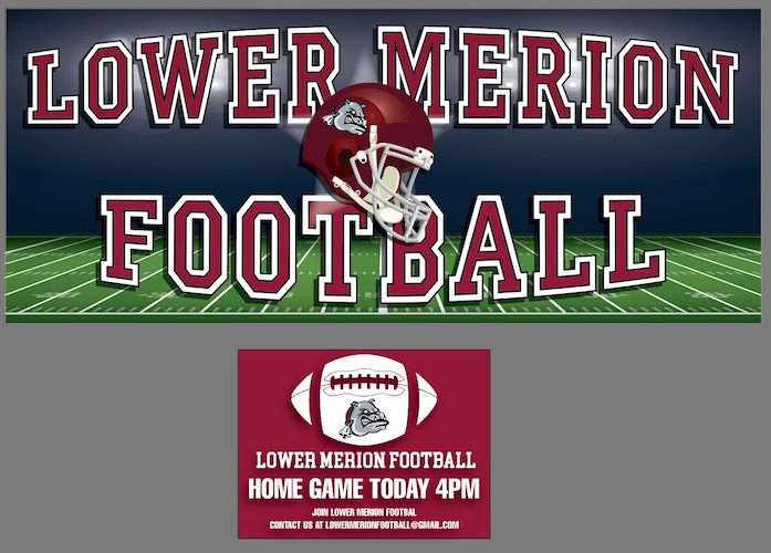
Lower Merion Football – High School Athletic Signage & Event Package
A co-branded athletic signage suite designed for Lower Merion High School Football, featuring a wide-format stadium vinyl banner and a directional event lawn sign. The package establishes a bold, high-impact aesthetic tailored to scholastic sports, utilizing classic varsity block typography, team colors and vector equipment art. The design system ensures high legibility across varying view distances, from field-side stadium banners to roadside directional signage.
Design Purpose: Team spirit, sports branding, and game-day event promotion for scholastic athletics.
Multi-Format Adaptability: Translates a unified brand identity across two distinct aspect ratios, a wide 2:1 horizontal field banner and a compact, high-contrast lawn sign.
Typography & Styling: Employs classic slab-serif varsity typography with bold white keyline borders and drop shadows to ensure maximum contrast and readability against stadium lights and dark backgrounds.
Vector Illustration & 3D Lighting Effects: Features a central vector football helmet with stadium spotlighting and stadium field graphics on the primary banner, paired with a clean bulldog mascot icon integrated into a football shape on the yard sign.
Production Readiness: Designed specifically for large-format outdoor vinyl printing and rigid corrugated plastic (yard sign) output, built to withstand outdoor environment specs.
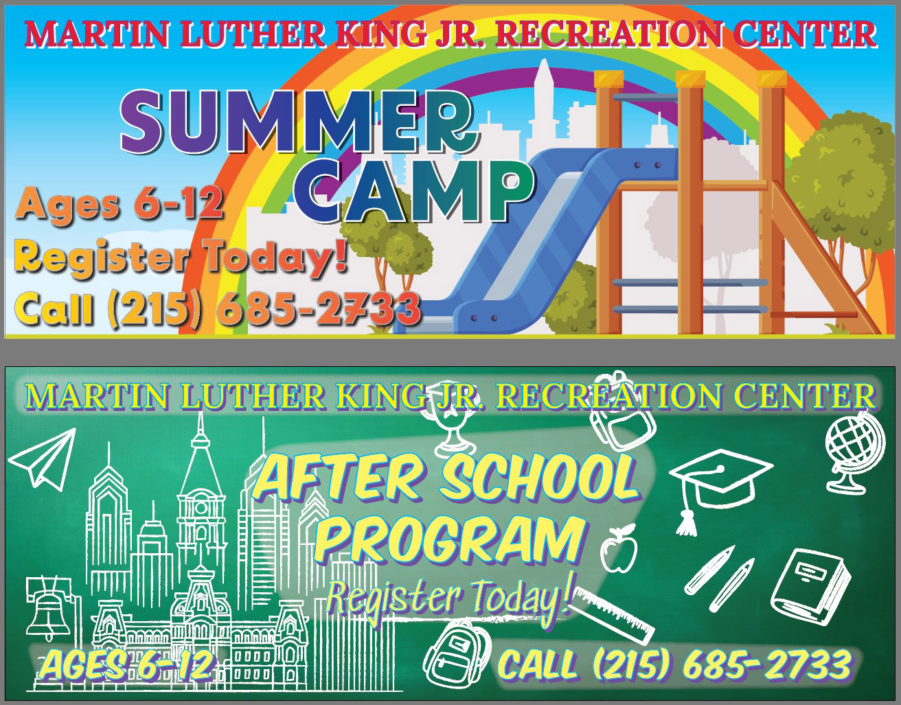
Martin Luther King Jr. Recreation Center - Seasonal Program Banner Series
A series of high-visibility, large-format vinyl banners designed for the Martin Luther King Jr. Recreation Center to drive registration for seasonal youth initiatives. The project features two distinct designs: an energetic, vibrant rainbow vector layout for the Summer Camp, and a chalkboard-style educational composition featuring Philadelphia skyline line art for the After School Program. Both layouts prioritize high legibility from a distance, clear information hierarchy and approachable, youth-friendly visual storytelling.
Design Purpose: Community engagement and sign-up promotion for local youth programming.
Large-Format Production: Built for wide-format vinyl banner output, ensuring sharp vector graphics, high-contrast typography, and readable call-to-action phone numbers for passing pedestrian and vehicular traffic.
Visual Hierarchy & Contrast: Utilizes bold outlines, heavy drop shadows, and glow treatments across primary headlines to guarantee maximum readability against complex graphic backgrounds.
Thematic Concepts:
Summer Camp: Uses a bright, saturated spectrum to evoke energy, outdoor activity, and summer fun.
After School Program: Employs a chalkboard aesthetic featuring educational icons paired with an intricate vector rendering of the Philadelphia skyline to anchor the program within the local community.
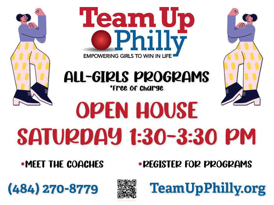
Team Up Philly – Open House Promotional Event Banner
A wide-format event banner created for Team Up Philly, a local non-profit organization dedicated to empowering young women through sports, fitness, and mentorship. Designed to drive attendance for a community Open House, the composition blends bold, energetic typography with illustrated figures symbolizing strength and confidence. The layout prioritizes clear information hierarchy, high-contrast readability, and immediate call-to-action details including contact information and an integrated QR code for instant digital registration.
Design Purpose: Non-profit event promotion, community outreach, and program awareness for local youth initiatives.
Brand Integrity & Color Palette: Strictly aligns with the primary organizational brand palette—anchored by crimson red and navy/royal blue against a clean white background for maximum contrast.
Visual Balance & Symmetry: Features mirrored vector character illustrations framed on either side to visually anchor the message and reinforce themes of female empowerment and athletic strength ("Rosie the Riveter" style flexing pose).
Typography & Hierarchy: Pairs a heavy serif brand logotype with playful, high-visibility headline fonts to keep the tone welcoming, accessible, and community-focused while maintaining strong legibility from a distance.
Multi-Channel Call to Action: Integrates multiple contact pathways, a prominent telephone number, website URL, and a scannable QR code optimized for large-format print production.
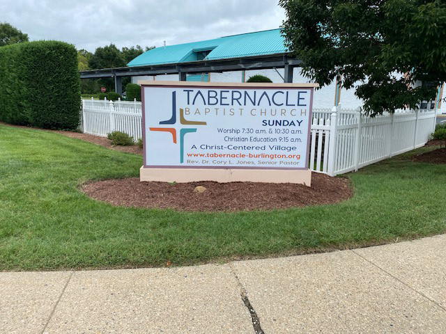
Tabernacle Baptist Church – Exterior Lightbox Monument Sign Face Design
A custom exterior lightbox monument sign face designed for Tabernacle Baptist Church in Burlington, NJ. The project required balancing clean modern branding with high-functionality roadside readability for vehicular traffic. The design seamlessly integrates the church's multi-color cross logo, service schedules, organizational tagline, website URL, and pastoral leadership details into a balanced, professional layout built for day-and-night illuminated visibility.
Design Purpose: Primary outdoor entrance identification and informational signage for a religious institution.
Environmental & Lightbox Production: Engineered for translucent acrylic face printing and internal LED backlighting, ensuring high contrast and clarity during daytime daylight and nighttime illumination.
Information Hierarchy & Layout Balance:
Primary Focus: Bold, modern brand mark paired with prominent brand typography.
Secondary Information: Right-aligned, structured service times utilizing varied font weights for easy scanning.
Footer Accent: Color-matched orange website callout tied directly to the orange accent in the brand logo for visual harmony.
Color Strategy: Utilizes a refreshing palette of slate blue, deep navy, metallic bronze/tan, and vibrant orange, matching both the organization’s visual identity and the teal accent architecture of the physical campus behind it.
Scale & Substrate Specs: Designed to fit a permanent stone-and-trim monument cabinet enclosure, adhering to local zoning and directional sightline requirements.
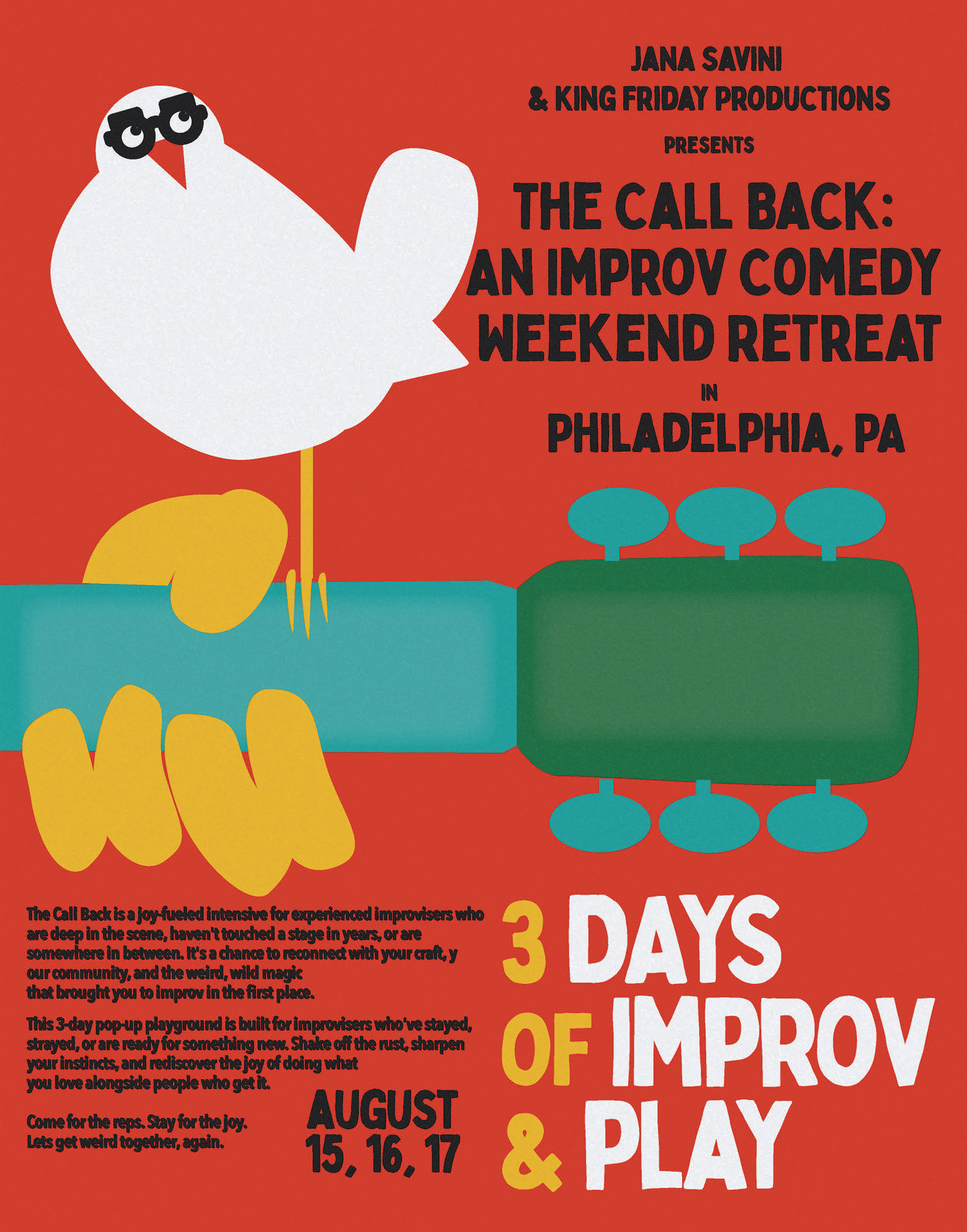
"The Call Back" – Improv Comedy Retreat Pop-Art Poster
A promotional event poster created for The Call Back, a three-day improv comedy weekend retreat in Philadelphia. The design serves as a playful, modern pop art homage to the iconic 1969 Woodstock festival poster ("3 Days of Peace & Music"), reimagining the famous bird-on-a-guitar artwork as a comedic visual metaphor. By swapping the classic dove for a quirky, Groucho glasses-wearing white bird and framing the copy with bold, hand-hewn typography, the poster immediately signals nostalgia, creative freedom, and lighthearted collaboration to the local comedy community.
Design Purpose: Promotional campaign poster for a 3-day comedy intensive, targeting experienced improvisers across theater and live performance networks.
Visual Parody & Concept Execution: Faithfully translates the composition, color theory, and cut-out aesthetic of the classic 1969 Woodstock poster while infusing custom comedic character touches.
Typography & Copy Layout:
Headline: Features distressed, block-cut vintage display lettering that echoes the counterculture aesthetics of late 60s print collateral.
Body Copy: Utilizes a high-contrast sans-serif layout set in two structured columns for fast scanning and readability.
Color Strategy: A warm, high-impact palette combining burnt crimson/terracotta red, warm mustard yellow, and vibrant teal accents against crisp white shapes for instant visual pop.
Vector Illustration: Flat, organic-shaped vector work mimicking traditional paper cut-outs, preserving the rustic, handmade feel of mid-century print art.
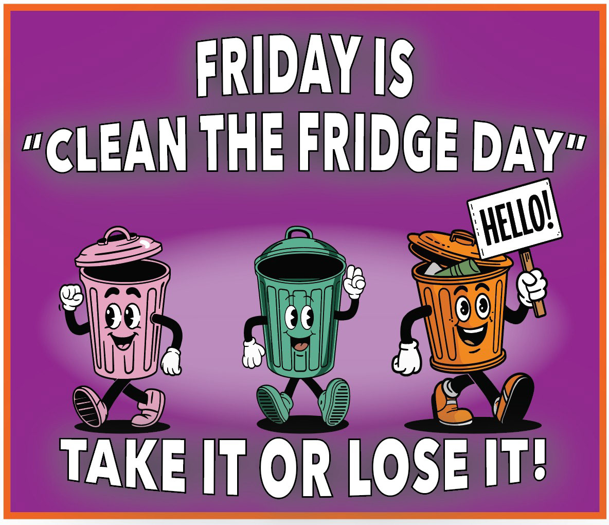
"Clean the Fridge Day" – Custom Workplace Magnet
An illustrated workplace magnet designed to serve as a friendly, high-visibility reminder for office breakrooms. Utilizing a playful, vintage 1930s "Rubber Hose" animation style complete with pie eyes, white gloves and expressive character poses, the design transforms routine office etiquette into an engaging visual story. The vibrant purple background and bold, outlined typography ensure the message is immediately legible, encouraging workplace compliance through humor and approachable design.
Design Purpose: Internal communications, workplace signage and novelty specialty print design.
Character Illustration & Nostalgia Marketing: Features three mascot characters in a classic retro animation style to deliver a direct message with lighthearted charm.
Typography & Copy Layout: Uses a bold, condensed sans-serif display font with heavy black keylines and white fills, ensuring strong contrast against the rich purple background for maximum legibility at a distance.
Color Strategy: A saturated, high-contrast palette featuring a royal purple vignette background paired with pastel pink, seafoam green, and warm orange character accents to create a lively, balanced composition.
Print Specialty Production: Designed with clean bleed lines and precise edge borders, optimized for heavy-duty magnetic substrate printing suitable for office appliances and steel surfaces.
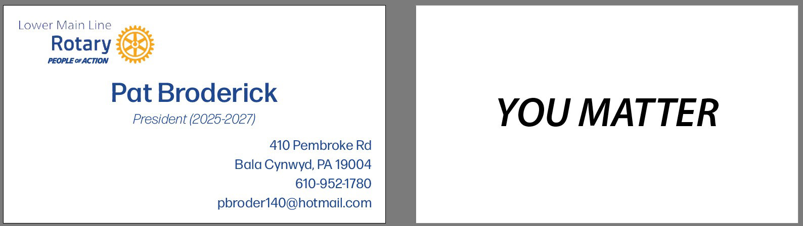
Lower Main Line Rotary – Double-Sided Executive Business Card Design
A clean, double-sided business card designed for the President of the Lower Main Line Rotary Club. The design strictly adheres to global Rotary International brand guidelines, balancing official club identity assets with a clean, highly scannable layout. The front uses a structured diagonal layout to separate the organizational identity, name and contact details, while the reverse side uses minimalist, high-impact typography to feature the club’s core inspirational mantra.
Design Purpose: Professional executive identity collateral and networking tool for civic leadership.
Brand Standards Compliance: Seamlessly integrates official Rotary International logo assets including the gold wheel mark, royal blue typography and the "People of Action" tagline, maintaining strict brand consistency.
Typography & Information Hierarchy:
Front: Uses clear sans-serif scale variations to establish a distinct visual path for the reader's eye.
Back: Features a bold, italicized, dark-mode statement set centrally against an open white canvas for maximum emphasis and emotional resonance.
Layout & White Space: Utilizes generous negative space to ensure the card feels sophisticated, uncluttered and easy to read at a glance.
Print Production Specifications: Set up for standard 3.5" x 2" double-sided offset print output with precise margin alignment and print-safe bleed zones.
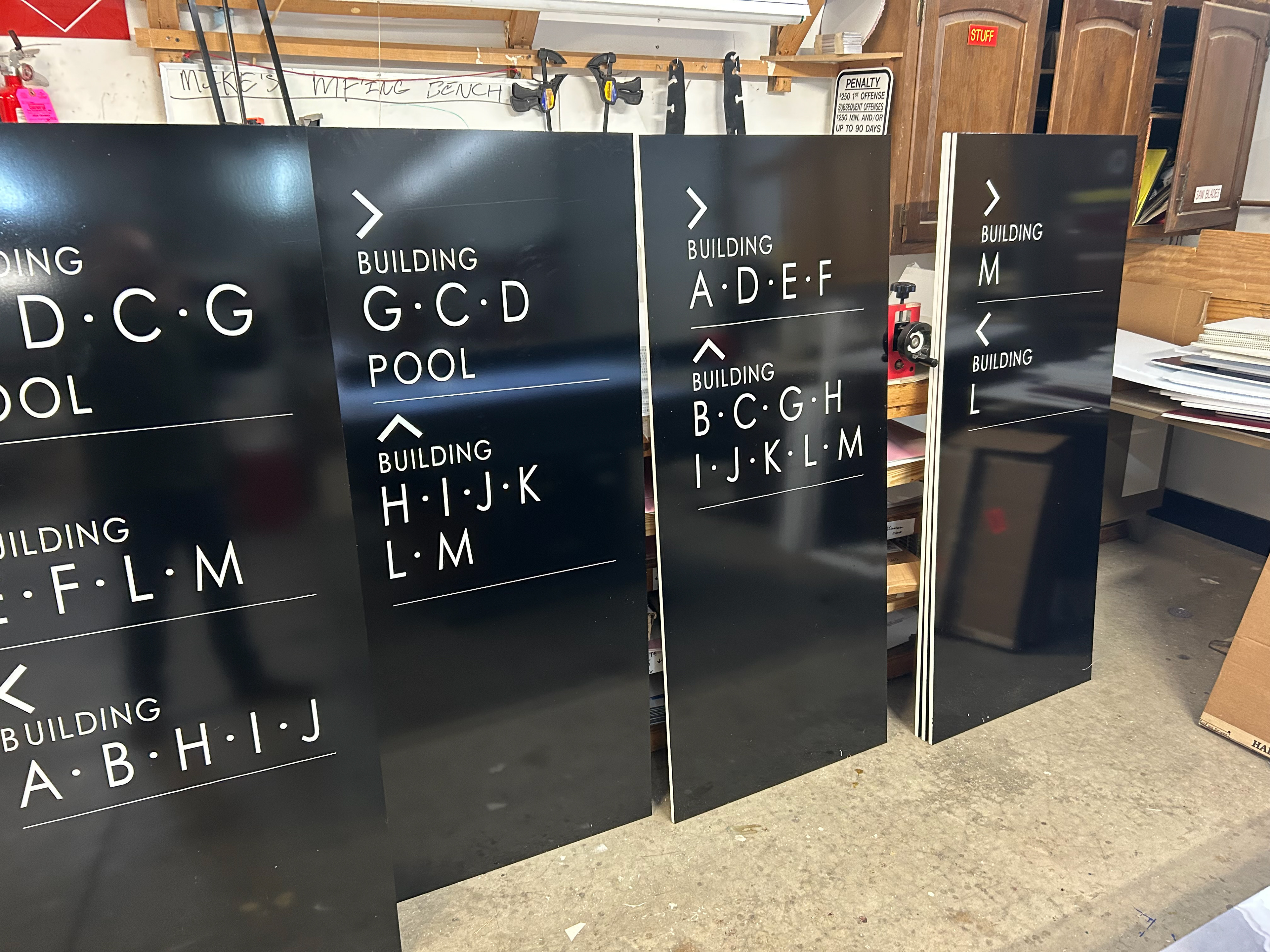
Residential Apartment Complex – Environmental Wayfinding & Directional Signage System
A custom outdoor directional sign system designed and fabricated for a multi-building residential apartment complex. Built to improve property navigation for residents, guests, and delivery services, the wayfinding suite utilizes high-contrast monochrome aesthetics, modern geometric typography and clear directional iconography. The modular layout organizes multi-building destinations with clean horizontal rules and intuitive chevron arrows, balancing architectural modernism with immediate functional clarity.
Design Specialty: Environmental Graphic Design, wayfinding system architecture, and site navigation.
Typography & Legibility: Features a clean, geometric sans-serif typeface set in crisp white vinyl against a black substrate. Bullet separators and tracked-out lettering maximize distance readability for slow-moving vehicular and pedestrian traffic.
System Layout & Information Architecture:
Organized into stacked visual zones divided by subtle keylines to separate distinct directional paths.
Utilizes oversized chevron arrows to give immediate visual orientation before the viewer processes the text details.
Substrate & Fabrication Specifications: Produced on durable, weather-resistant aluminum composite panels with high-performance black vinyl overlays and precision-cut white vinyl graphics designed for long-term exterior durability.
Scalable Modular System: Designed as a repeatable design matrix where individual building letter combinations and facility destinations can be swapped across different site placement nodes while maintaining uniform system branding.
Multi-Style Motion Graphics & Kinetic Typography Reel
A dynamic 2D/3D motion graphics showreel featuring three distinct period-inspired promotional concepts. The reel highlights expert pacing, frame-by-frame character animation, dynamic camera transitions, and tight audio-driven keyframing. By shifting fluidly from 1960s flat-vector pop art to 1920s rubber-hose black-and-white animation, and ending on a flashy 1970s disco light-board promo, the piece demonstrates broad creative range and high-level kinetic storytelling.
Design & Animation Specialties: 2D Vector Motion, Kinetic Typography, Audio-Visual Synchronization, Multi-Era Visual Homage, Character Rigging and Dynamic Transitions.
Scene Breakdown & Art Direction:
0:00–0:06 (Summer Brewery Concept): Utilizes flat vector pattern motion, 3D text extrusions, kinetic palm tree reveals and seamless wiping transitions.
0:07–0:14 (Vinnie’s Barbershop / 1920s Cartoon Style): Features custom Felix-the-Cat-style clock character animation, vintage film grain overlays, starburst typography callouts and jaunty ragtime audio sync.
0:15–0:26 (Philadelphia Brewing Co. / 70s Disco Party): Blends 3D lighting effects, multi-color rainbow trailing graphics, confetti particles and neon-style inline typography paired with a funky disco groove.
Audio-Visual Timing: Keyframed directly to musical beats and percussive accents to enhance viewer engagement and maintain natural visual momentum.
Brand Integration: Demonstrates how diverse artistic styles can incorporate corporate, retail or local brand marks naturally into thematic promotional media.